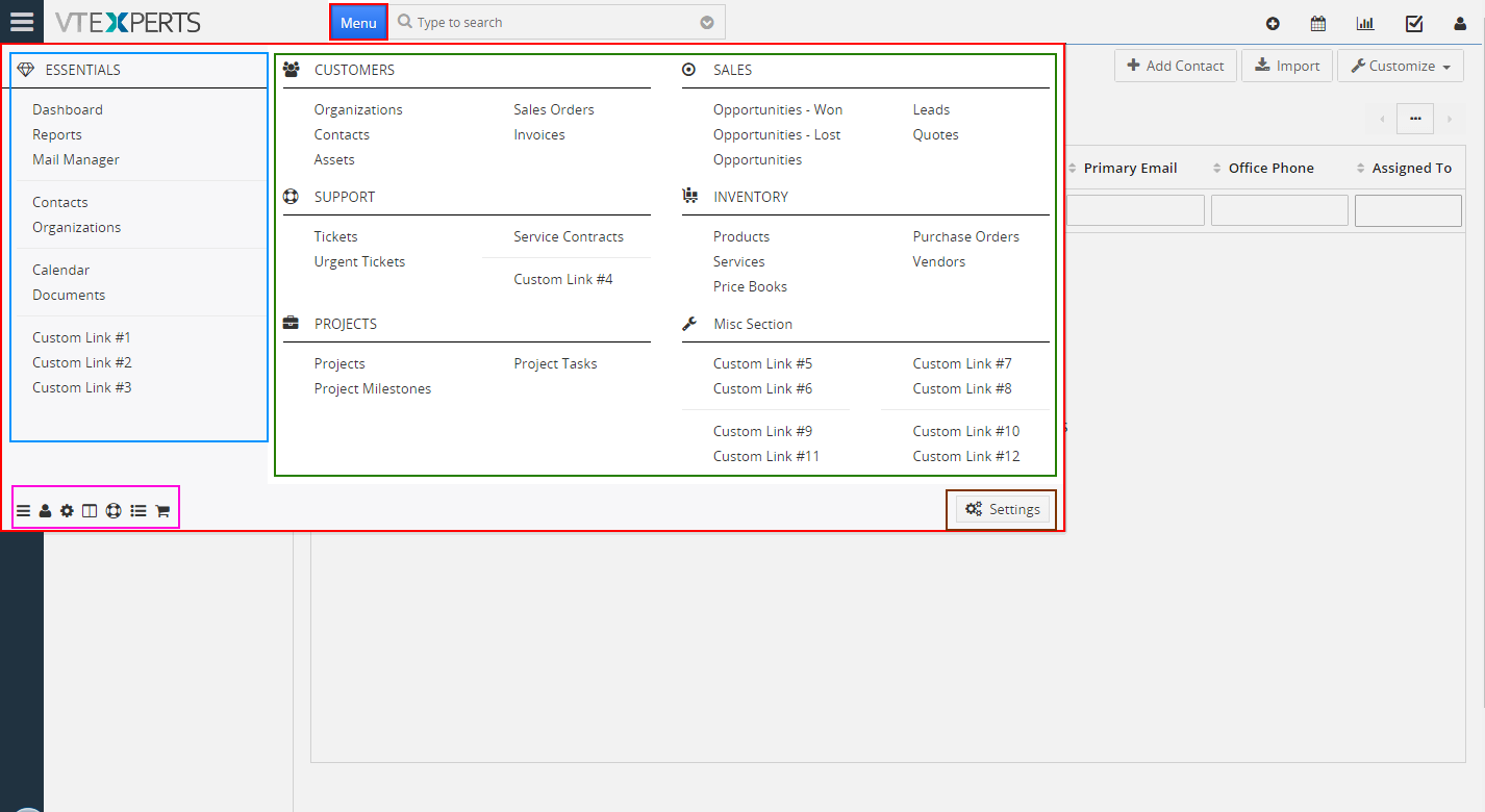
Menu Manager is an extension, which allows system administrators to completely redesign standard VTiger menu and transform into an easy to use and intuitive menu. It displays all the modules/links on one popup, making it extremely convenient for every CRM user.
It has built in menu builder, which makes it super easy to design the menu. Menu items such modules, filters, custom links, separators can be added to the menu. In addition, “block” titles and icons can be changed to whatever makes the most sense for your business.
Configuration
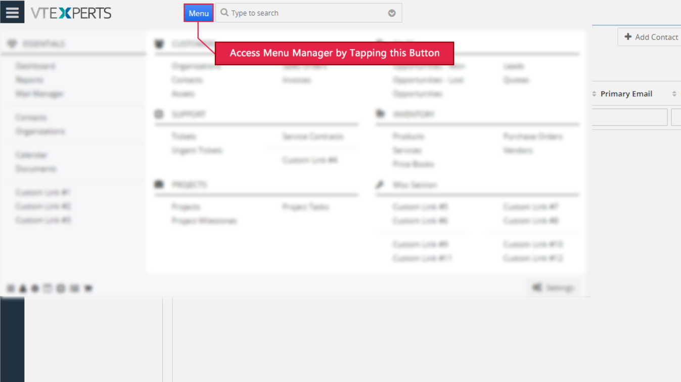
Advanced Menu Manager can be configured either going into CRM Settings > Other Settings > Advanced Menu Manager or opening the custom Menu button and clicking the “Advanced Menu Manager” button at the bottom left.
You’ll see something like this. It may vary depending upon how the default menu is arranged and which modules are enabled/available:
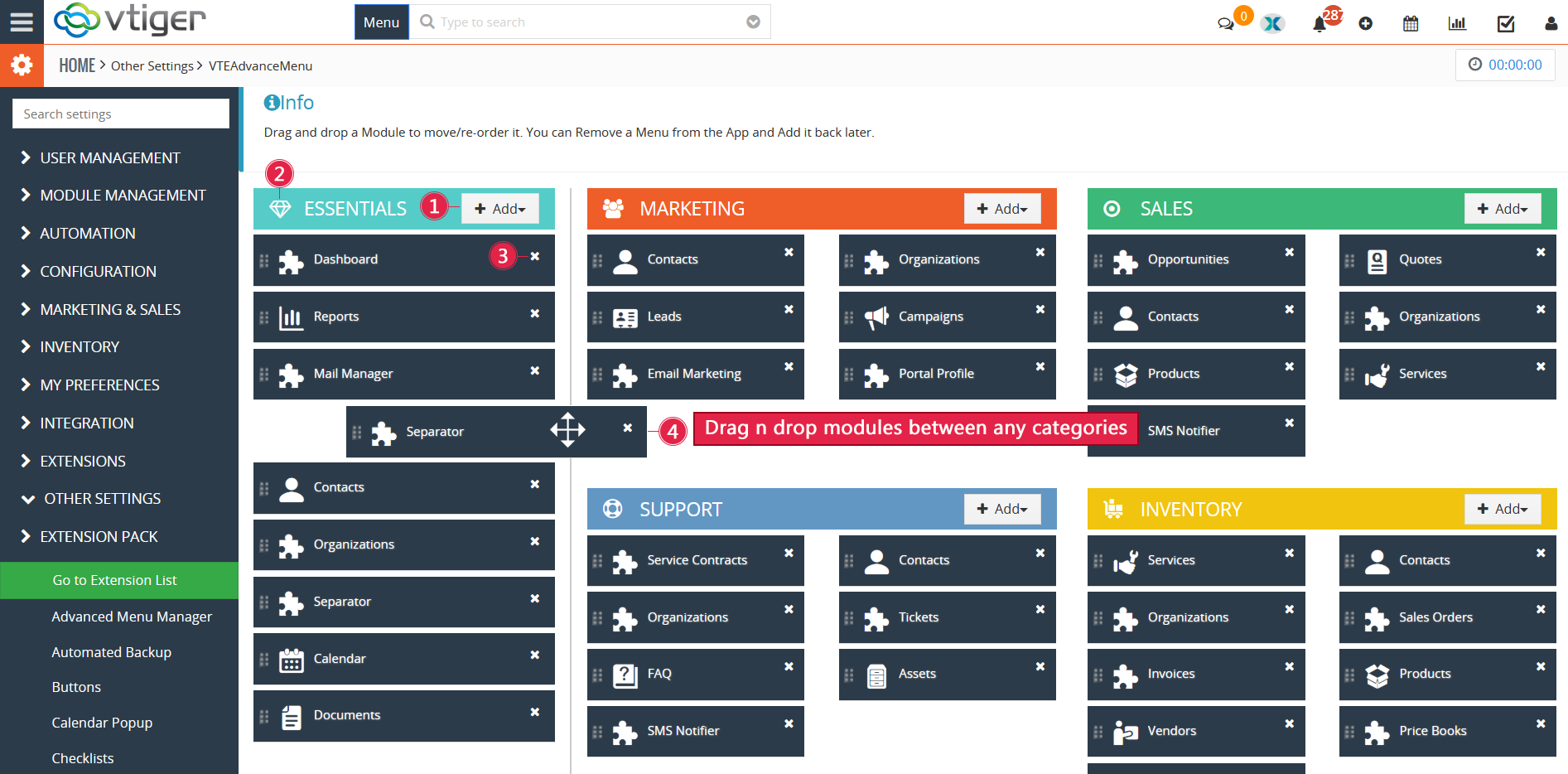
Understanding the UI, all the categories are organized here in columns headed by different colors. So you can easily drag n drop a module from a sub category to same section (to rearrange) or to another subcategory. The UI is discussed later in the guide.
+Add: it’s a dropdown you can use to add new modules, links, filters, or separators to an existing part/category of the menu
Edit: hover your mouse over a heading of the subcategory to reveal a tiny Edit button at the left of the icon. This helps configuring the menu further
Remove: to remove a module from a list, use the x button available at every module
Drag & Drop modules: move the modules around within a subcategory or multiple lists. Pick the module from its left by the drag & drop indicator.
+Add
You will four options in the “+Add” button on a category:
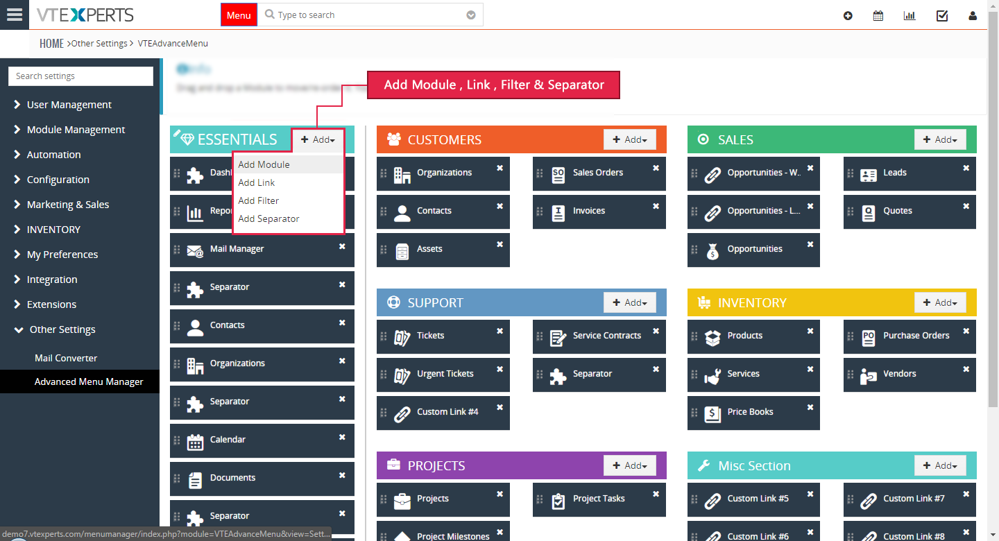
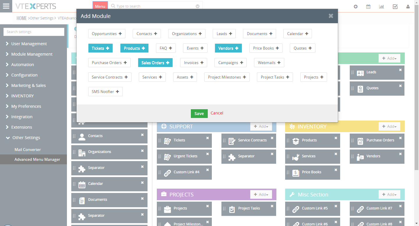
Add Module: add new modules to the corresponding sub category. Clicking the “New Module” will display all the available modules in a box. Simply click on the name of a module, hit save and it will be added to the sub-menu.
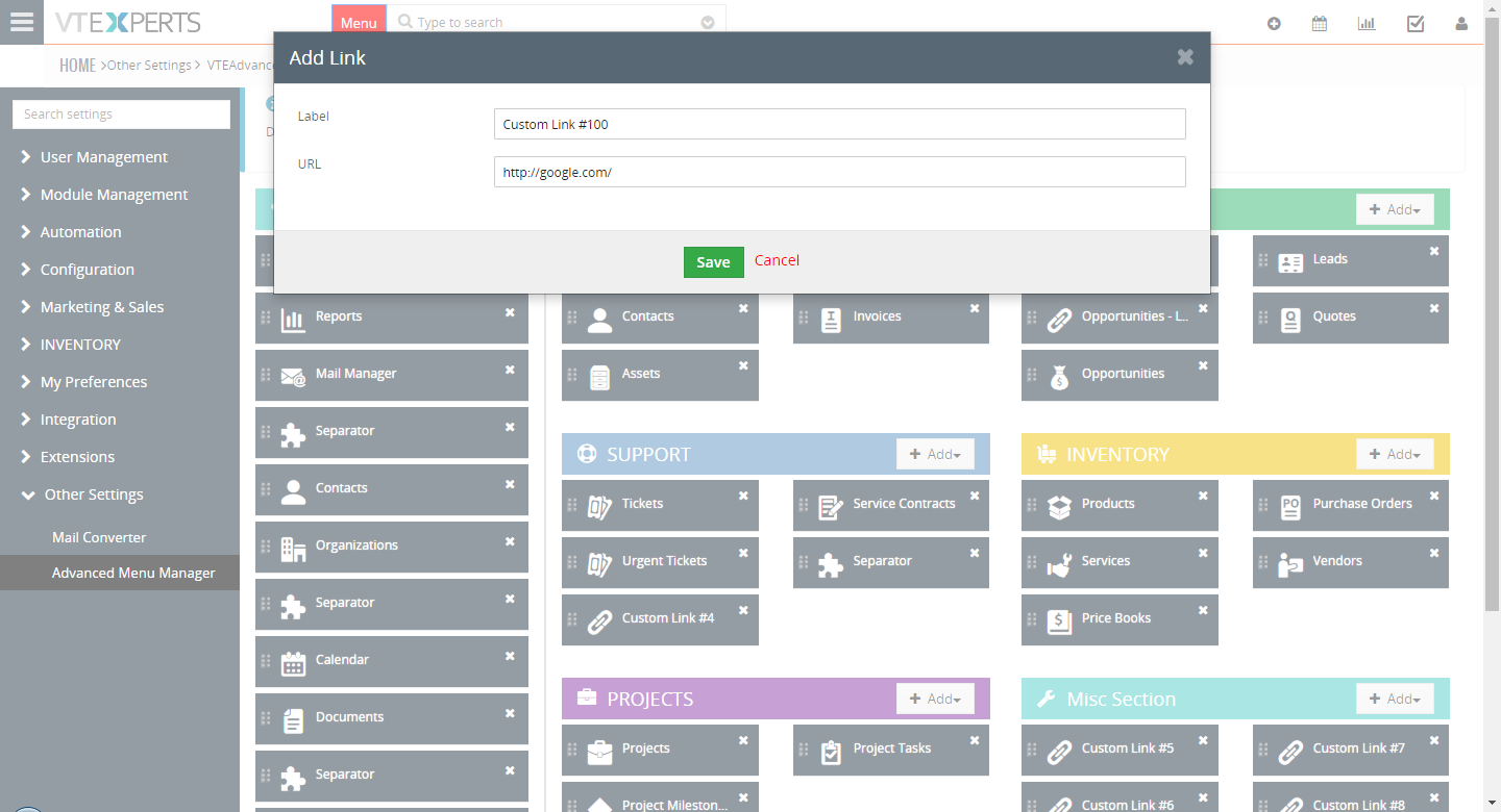
Add Link: add a shortcut to any link to quickly open it in your browser. Put a name and the URL in the corresponding fields.
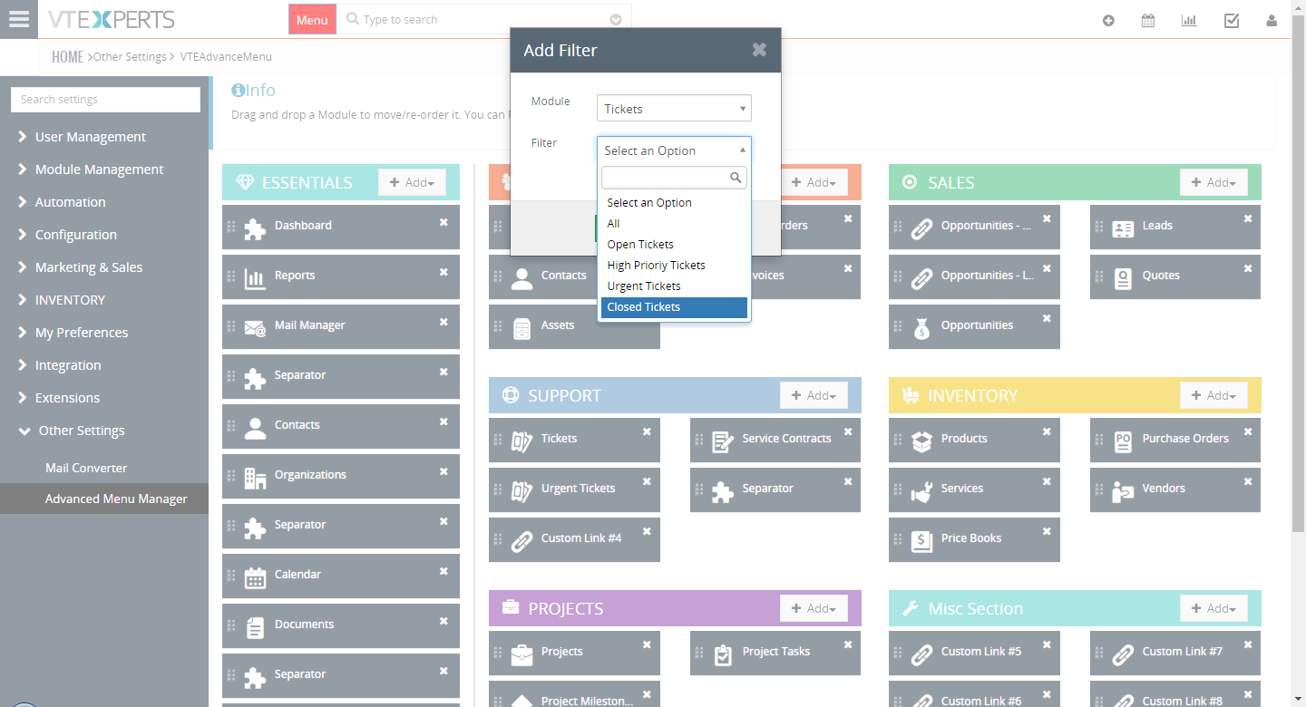
Add Filter: with this feature, you can add a quick access to any filter in any module. Just select a module and it will fetch the available filters for it. Add it to the list and the filter can be accessed right from the menu.
Add Separator: add a separator in a list to divide the sub sections and keep it tidy.
Edit
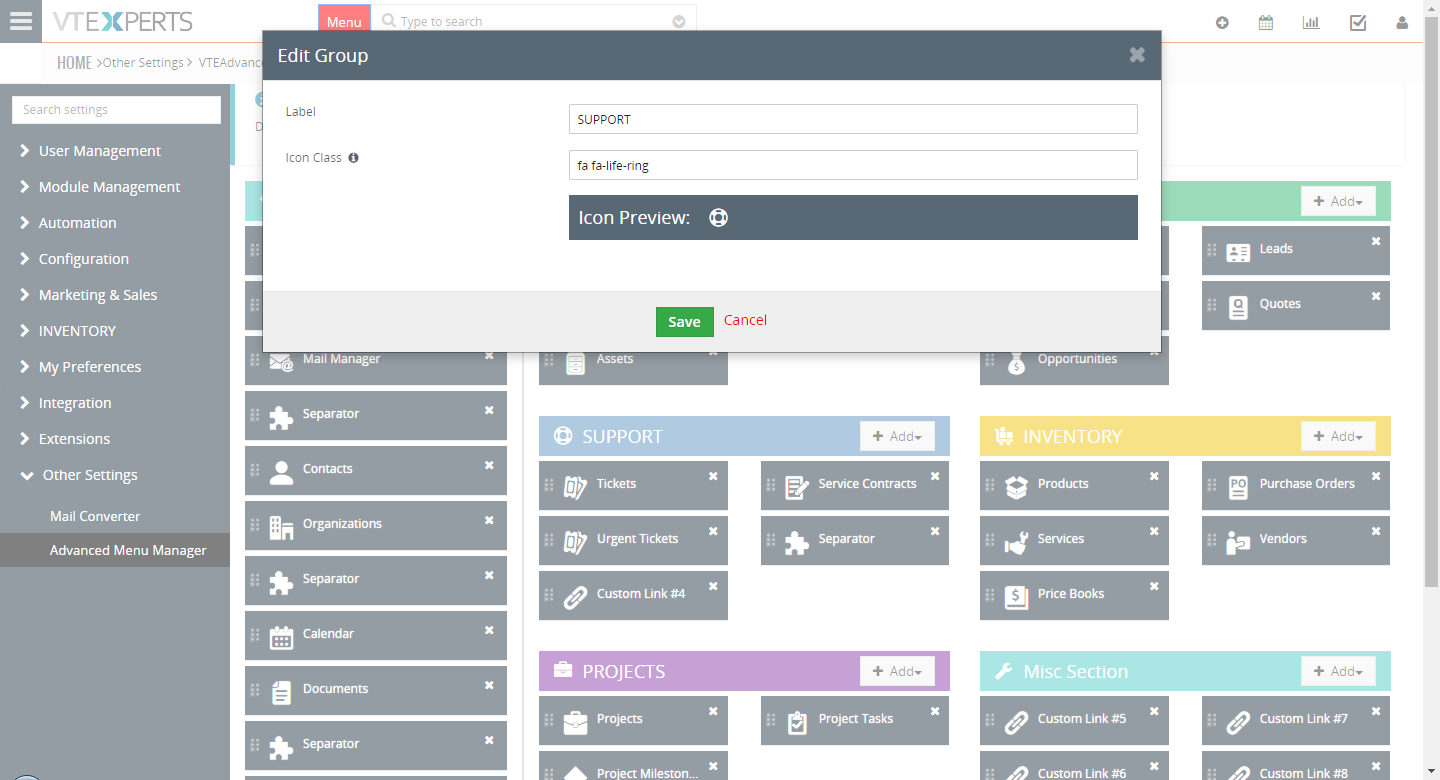
This tiny button that appears on a category when you take your mouse pointer over it, allows to customize the category further. You get following fields:
Label: it allows to change the current title of the category and customize it according to your needs
Icon Class: To allows you change the current icon of the category. Provide the patch for the icon and it will be updated
Icon Preview: It will show the preview of icon that you have selected
Scanning new Modules
When a new custom module is added to the CRM, Main menu detect it and shows a message “X new custom module(s) have recently been installed – please click here to add them to the menu”
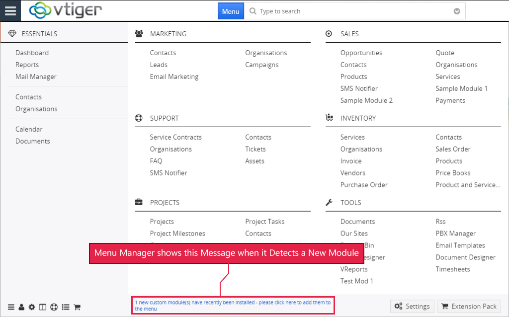
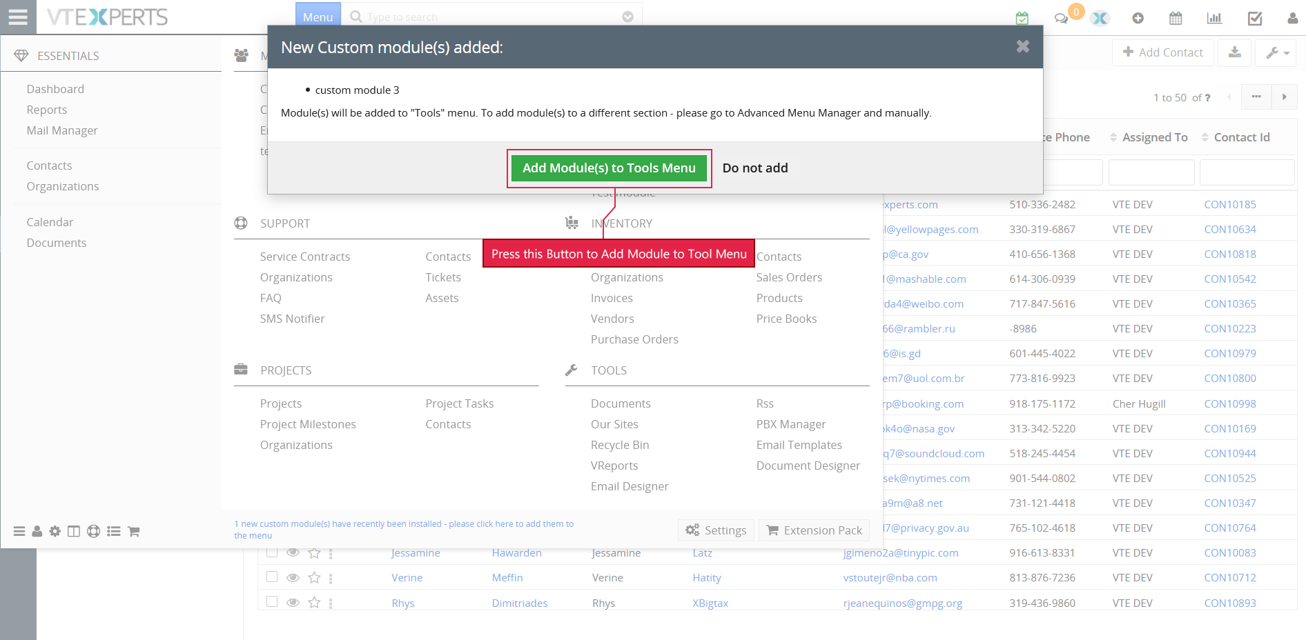
Click the highlighted message a new window will open which will ask to “Add Module(s) to Tool Menu”. press that button and new custom module will appear under the TOOLS
Understanding the UI
The Menu is pretty simple, familiar, and easy to use. It is designed to enhance the productivity and improve the time spent per routinely tasks.
The left section is reserved for ‘Essentials’ and its contents. The categories are divided with dark separators, while the manually added separators are shown as light grey. The other categories are aligned in the remaining columns at right.
There are several useful buttons put together in a row at bottom left of the menu including Advanced Menu Manager Configuration, User and Module managers, and several others. At the bottom right is the quick link for CRM Settings, which is currently available at a 3 step effort.
