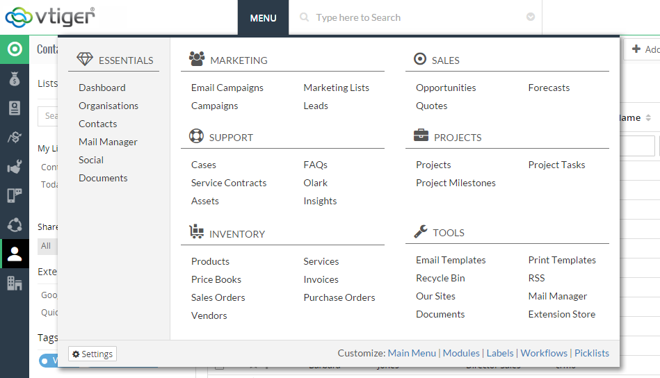
The users of Vtiger recently experienced the new main menu that is designed with an aim to make it more user-friendly. The new layout makes it very simple for the user to understand it and navigate through. This latest menu gets advantage over the previous left-sided menu, launched with Vtiger 7, in all the following ways:
It’s easier and faster to access the main menu.
Now user can access the main menu from almost middle of the screen instead of the upper-left corner. This is the position where you can take the cursor easily. It’s faster because it reduces the total distance covered to get that spot.
There are no more nested menus to browse modules.
The user is enabled to browse to any module from the main menu in a single motion. For this, the main menu has been split into two main portions: the left and the right. The left column is used to access commonly used modules like contacts and organizations. These are sub-categorized under the main category of “Essentials”. The right column contains function-specific modules like opportunities or cases. These are placed under their respective functional areas i.e., sales and support.
Finding Vtiger’s key settings is swift.
The most frequently accessed settings of Vtiger are can be accessed faster now. The menu’s lower horizontal bar contains link to Vtiger’s key settings. That’s not all; the user can now access the extension store from that bar as well.
User can customize and create its own left menu bar.
While the new main menu is similar for all the users of Vtigers, it can be modified by every user as per their ease. The menu appearing on the far left side of user screen can be customized to show any module. The user can now customize 5 different menu profiles on the left side of user screen, and can choose any of those profiles to appear on its own screen. That means the support team can have a left bar that shows cases and service contracts at the top, while the sales team can have opportunities and quotes at top.


